Hey friends,
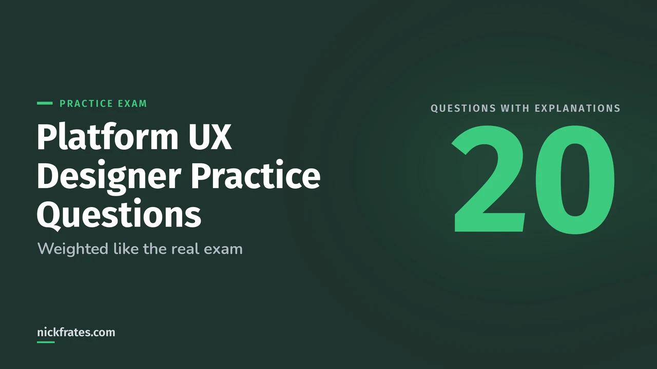
These 20 Salesforce Platform UX Designer practice questions are original, weighted like the real exam's six sections, and each one has the answer and an explanation in a dropdown. I wrote them from the objectives in the official exam guide and the sources it points to. None are real exam questions.
The real exam, Salesforce Certified Platform User Experience Designer, has 60 scored questions in 105 minutes, and the passing score is 65%. So aim for 13 of these 20 on a first try, then read the explanation for every miss, including the lucky guesses. Most questions are scenarios: a team, a problem, and the best next move.
Split here: Discovery 13% (3 questions), UX Fundamentals 16% (3), Human-Centered Design 12% (2), Declarative Design 27% (6), Testing 11% (2) and the Salesforce Lightning Design System (SLDS) 21% (4). For the full topic map, see my Platform UX Designer study guide.
Discovery (13%): 3 questions
Question 1. Stakeholders say users love the new search bar. You want evidence of what people actually do with it before changing anything. Which research choice fits best?
- A. Send a survey asking users to rate the search bar
- B. Watch users complete search tasks and review search usage data
- C. Run a focus group about search
- D. Ask the sales managers what they hear
Show the answer and explanation
Answer: B. You're after what people do, and that's behavioral research. Surveys, focus groups and asking managers capture what people say or what others report, which is attitudinal. NN/g's guide to UX research methods explains the difference, and notes that the two often disagree.
Question 2. A company is building a help center with 40 articles and doesn't know how to group and label them. Which method helps most at this stage?
- A. A/B test two homepages
- B. Card sorting
- C. Eye tracking
- D. Tree testing
Show the answer and explanation
Answer: B. In card sorting, participants group labeled cards in ways that make sense to them, which shows you their mental model for new content. Tree testing comes later, to check whether people can find items in a structure you already drafted. See NN/g on card sorting.
Question 3. A project team writes personas by listing job titles, ages and which Salesforce screens each person opens. What should the designer change?
- A. Add each person's salary band
- B. Base each persona on goals, behaviors and motivations, not just titles, demographics or screen usage
- C. Write one persona per department head
- D. Remove the personas and rely on user stories
Show the answer and explanation
Answer: B. Trailhead's UX Designer prep says Salesforce personas are built from users' goals, behaviors and motivations. Titles and demographics can mislead, and what people do in Salesforce can change over time. After that, introduce the personas to the team and write user stories together, which is covered in the Discovery unit of the Trailhead prep module.
UX Fundamentals (16%): 3 questions
Question 4. A team has three layout ideas for a case page and wants quick feedback this week. Which prototype is the better fit and why?
- A. High-fidelity, because users take it more seriously
- B. Low-fidelity, because it's fast to make and easy to change, and it keeps testers focused on structure and flow
- C. High-fidelity, because stakeholders approve faster
- D. Low-fidelity, because users can't give feedback on it
Show the answer and explanation
Answer: B. Early on, speed matters. NN/g lists benefits of low-fidelity prototypes: less prep time, easy changes between sessions, less pressure on users, and designers who are less attached to the draft. High-fidelity pays off later, for testing polished interactions. More in low-fidelity vs high-fidelity wireframes.
Question 5. A table shows order status only with a red or green dot. What's the best accessibility fix?
- A. Use a darker red and green
- B. Add a text label or distinct icon next to each dot
- C. Make the dots larger
- D. Remove the green dot
Show the answer and explanation
Answer: B. Color shouldn't be the only way to show meaning. Success Criterion 1.4.1 in the Web Content Accessibility Guidelines (WCAG) asks for another cue, such as text or a shape. Larger or darker dots still fail anyone who can't tell the colors apart.
Question 6. A designer is building a long page for screen reader users. Which choice helps them navigate it fastest?
- A. A clear heading structure with meaningful headings
- B. Bright accent colors on section titles
- C. A tooltip on every section
- D. Short paragraphs with no headings
Show the answer and explanation
Answer: A. Screen reader users commonly jump from heading to heading, as Trailhead's UX Designer prep notes. Real headings with a sensible hierarchy are how a screen reader finds sections. Visual styling alone doesn't create structure for assistive technology.
Human-Centered Design (12%): 2 questions
Question 7. A team checks that its idea is desirable, feasible and viable. According to Trailhead's relationship design material, which three criteria does relationship design add?
- A. Community, collectivity, clarity
- B. Inclusivity, sustainability, ethics
- C. Credibility, relatability, unity
- D. Productivity, empathy, intimacy
Show the answer and explanation
Answer: B. Human-centered design weighs desirability, feasibility and viability. Relationship design widens that to inclusivity, sustainability and ethics. It comes up in the Human-Centered Design unit of the prep module.
Question 8. A retailer keeps losing customers at the handoffs between its website, its app and in-store pickup. Which discipline is the best fit to fix that?
- A. Service design, because it looks at the whole customer experience across touchpoints
- B. Visual design, because it fixes colors
- C. A/B testing, because it picks winners
- D. Content strategy, because it rewrites copy
Show the answer and explanation
Answer: A. Service design looks at the total experience across channels, online and in person. UX design usually focuses on a person's experience with one product or service.
Declarative Design (27%): 6 questions
Question 9. A new rep logs in to Lightning Experience for the first time and doesn't know where to start. Which feature gives getting-started resources on that first login?
- A. Welcome Mat
- B. Empty State
- C. A floating prompt
- D. A utility bar item
Show the answer and explanation
Answer: A. The Welcome Mat is a component that offers getting-started resources the first time someone logs in to Lightning Experience. It's listed in the Declarative Design unit's flashcards.
Question 10. A related list is empty for new accounts, and users aren't sure what to do next. Which feature replaces the blank space with instructions on next steps?
- A. Empty State
- B. Dynamic Forms
- C. Path
- D. Compact layout
Show the answer and explanation
Answer: A. The Empty State feature replaces a blank section with guidance on what to do next. Path guides people through stages, and Dynamic Forms controls which fields appear.
Question 11. A policy changed and you want users to read a one-line notice and dismiss it, with no action required. Which in-app guidance fits best?
- A. A floating prompt
- B. A docked prompt with step-by-step instructions
- C. A walkthrough video in a prompt
- D. A new Path stage
Show the answer and explanation
Answer: A. Floating prompts suit acknowledgments with no action. Docked prompts are the better fit for multi-sentence messages and step-by-step instructions that people consult while they work.
Question 12. Users rarely open the help menu, but they would clearly benefit from guidance on a new feature. Which approach should the designer use?
- A. A pull approach, because users will search when they need to
- B. A push approach, because the help has to find the user
- C. Training slides only
- D. No guidance, since the feature is simple
Show the answer and explanation
Answer: B. Push guidance reaches people who may not notice or seek out help, such as in-app prompts. Pull guidance works when users are motivated to look for help themselves.
Question 13. Reps need to see every product an account has bought on the Account record page. What data setup makes that possible?
- A. Give the Account object a lookup to Product
- B. Give the Product object a lookup to Account, then add a related list of Products to the Account page
- C. Copy product names into a text field on Account
- D. Add Accounts as a related list on the Product page
Show the answer and explanation
Answer: B. A related list shows child records on the parent's page, so the Product record needs the lookup to Account. The reverse would list Accounts on the Product page. Data modeling basics are in lookup vs master-detail relationships and Salesforce data modeling.
Question 14. A record page has so many fields on the page layout that users scroll constantly. Admins want to show some fields only for certain record types and users. Which feature fits?
- A. Dynamic Forms with field visibility rules
- B. A bigger compact layout
- C. More page layout sections
- D. Report filters
Show the answer and explanation
Answer: A. Dynamic Forms breaks the record detail into individual Field and Field Section components in Lightning App Builder, and visibility rules show or hide them by record data, user or device. Salesforce Help notes hidden fields are for convenience, not for security. See the Lightning App Builder tutorial.
Testing (11%): 2 questions
Question 15. A team has drafted a new navigation structure and wants to know whether people can find things in it, before building any pages. Which method fits?
- A. Tree testing
- B. Card sorting
- C. Eye tracking
- D. Benchmarking the old site
Show the answer and explanation
Answer: A. Tree testing asks participants to find items in a text version of the structure, so you can evaluate the organization and labels. Card sorting is used earlier to create a structure. NN/g explains where each one fits in its card sorting guide.
Question 16. A designer tests that a page works without a mouse. Which two checks belong in a keyboard accessibility test? Choose 2.
- A. Keyboard focus is always visible
- B. Every clickable or hoverable item can receive focus
- C. Pages are tested only with a touch screen emulator
- D. Color contrast is the only thing checked
Show the answer and explanation
Answer: A, B. A keyboard test confirms people can see where focus is and reach every interactive element. Testing with a keyboard and a screen reader catches problems a visual review misses, which is the point of the Testing unit in Trailhead's prep module.
Salesforce Lightning Design System (21%): 4 questions
Question 17. A customer on the Salesforce Cosmos theme (SLDS 2) wants their brand colors across all custom components. What should the designer recommend?
- A. Override SLDS classes with custom CSS
- B. SLDS global styling hooks
- C. SLDS 1 design tokens
- D. Inline hex values
Show the answer and explanation
Answer: B. Salesforce's LWC guide says design tokens aren't supported in SLDS 2 themes, and global styling hooks replace them. Overriding SLDS classes is unsupported because those classes can change. See the SLDS 1 vs SLDS 2 comparison.
Question 18. A custom component uses component styling hooks named --slds-c-button-brand-color-background, and the admin plans to turn on the Cosmos theme. What's the guidance?
- A. Nothing changes, component hooks work in both
- B. Keep the org on SLDS 1 themes for now, since component-level hooks aren't supported in SLDS 2
- C. Rename the hooks to design tokens
- D. Delete the styling
Show the answer and explanation
Answer: B. Salesforce says component styling hooks (prefix --slds-c) aren't supported in SLDS 2 yet, and recommends staying on SLDS 1 themes if your components use them. Read it in the styling hooks guide.
Question 19. Which classes build a basic column layout with the SLDS grid system?
- A.
slds-gridon a container andslds-colon its children - B.
slds-rowandslds-cell - C.
slds-flexandslds-item - D.
slds-layoutandslds-block
Show the answer and explanation
Answer: A. You add slds-grid to the container and slds-col to the columns inside it. The grid supports up to 12 columns. Details are on the SLDS grid page.
Question 20. Which SLDS icon type is meant for quick actions on touch-screen devices?
- A. Utility icons
- B. Doctype icons
- C. Action icons
- D. Custom icons
Show the answer and explanation
Answer: C. Action icons go with quick actions on touch-screen devices. Utility icons are single-color glyphs for labels and actions, doctype icons show file formats, and standard and custom icons represent objects. See the SLDS icon library.
How did you do?
13 or more: you're near the 65% line, so work on your weakest section next. Under 13: go back through the topic posts and the Trailhead prep module, then retest. Declarative Design and SLDS together are 48% of the exam, so a miss there costs the most.
Cert Lab by Nick Frates
Practice every section of the exam
Rapid-fire questions for all six Platform UX Designer sections, with every option explained and current doc links.
Start the Platform User Experience Designer Cert Lab for $9.99 →Not ready to buy? Try a free lesson and see how fast you learn.
A bit about how I study. Focus on Force was my favorite resource on the way to 17 Salesforce certs. I started the traditional way, reading the study guide first and testing second, but rapid-fire practice tests are what actually made things stick. That's the loop Cert Lab is built on: quick questions, then explanations with current links, then go again.
FAQ
How many questions are on the Salesforce Platform UX Designer exam?
60 scored multiple-choice questions, plus up to five unscored ones, in 105 minutes.
What's the passing score?
65%.
How much does the exam cost?
US$200, and a retake is US$100, plus applicable taxes.
Are these real exam questions?
No. I wrote all 20 from the official exam objectives. They test the same skills, not the same questions.
Where should you go next?
- The Platform UX Designer study guide maps every section.
- UX research methods for the Discovery and Testing sections.
- The Salesforce Lightning Design System for the SLDS section.
Nick Frates, a senior Salesforce developer with 17 certifications, built the Platform User Experience Designer Cert Lab at nickfrates.com: rapid-fire practice questions for every exam section, each answer explained.
Cert Lab by Nick Frates
Let the Platform User Experience Designer Cert Lab test you to success
Lessons, flashcards, a quiz for each of the six exam sections and full practice exams, every answer explained.
Start the Platform User Experience Designer Cert Lab for $9.99 →Not ready to buy? Try a free lesson and see how fast you learn.
Hope this helps!
Best,
Nick