Hey friends,
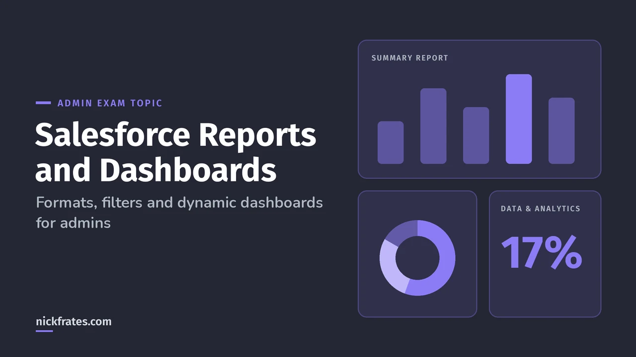
For Salesforce reports and dashboards, the Admin exam mostly tests three choices: which report format fits (tabular, summary, matrix or joined), which filter gets the right rows (field, cross filter or filter logic), and who a dashboard shows data as (a fixed running user or a dynamic dashboard). Get those three right and this part of the exam becomes easy points.
Reports and dashboards live in Data and Analytics Management, the biggest section of the Admin exam at 17%. The guide also calls out how the sharing model affects reports, which is where most people slip.
Report formats: tabular, summary, matrix and joined
Most reports you'll build are summary reports.
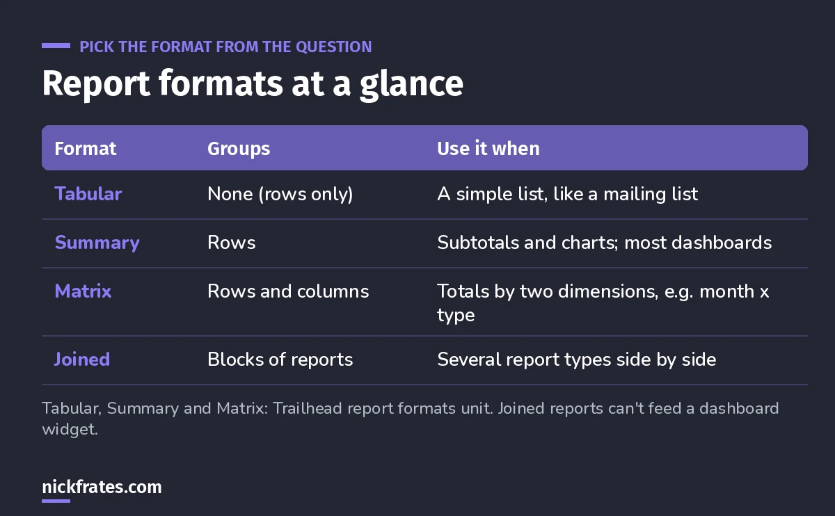
Trailhead's report formats unit puts it simply. Tabular is the default and works like a spreadsheet. Summary adds grouped rows, subtotals and charts, and it's the workhorse format. Matrix groups by rows and columns, so it's the one for totals across two dimensions, like revenue by month and opportunity type.
Exam pattern: if the requirement mentions two groupings at once (by region and by quarter), it's a matrix. If it needs a chart or a dashboard source with subtotals, it's summary. To add calculated values like win rate, see my Salesforce report formulas.
One more fact worth memorizing: you can't use joined reports or historical trend reports as the source for a dashboard widget. A tabular report can be a dashboard source only if you limit the number of rows it returns.
Report types decide what you can report on
Before format comes the report type, which decides which objects and fields are available. If a user says "I can't find that field in my report", the fix is usually a custom report type that includes the related object, not a new field.
Filters: getting exactly the right rows
Cross filters are the ones people forget exist.
From Trailhead's filter unit:
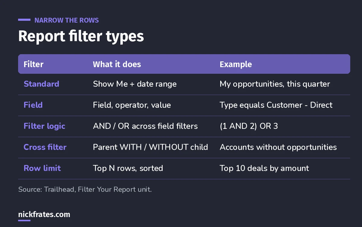
- Standard filters come with most objects: Show Me (like My accounts or All accounts) and a date field with a range. Use the smallest date range you can, because big ranges make reports slow.
- Field filters set a field, an operator and a value. Be careful with not equals, which Trailhead warns can make a report slow or time out.
- Filter logic adds AND and OR conditions across field filters. You need at least one field filter first, and it doesn't apply to standard filters.
- Cross filters filter a parent by its children using WITH or WITHOUT, and you can add subfilters on the child's fields. They're built for exception reports.
Worked example. Sales wants contacts that have no account so they can clean them up. Answer: a Contacts report with a cross filter of Contacts without Accounts. No formula field, no code.
Worked example. Erin wants open opportunities that have a high probability or a big amount. Answer: filter logic, something like 1 AND (2 OR 3).
Cert Lab by Nick Frates
Practice the Data and Analytics section free
Lessons and practice questions on report types, formats, filters and dashboards, with explanations for every option. All 8 Admin sections, free.
Start the free Admin Cert Lab →Dashboards and the running user
A dashboard shows several source reports side by side as widgets: charts, gauges, metrics and tables. Trailhead's visualizing data unit also covers report charts, which put one chart at the top of a single report when you don't need a whole dashboard.
The key exam concept is whose data the dashboard shows:
- A fixed running user: everyone sees the dashboard as that one person sees it.
- A dynamic dashboard: each viewer sees only the data they have access to, based on their own security and sharing.
- Let viewers choose: with the right permissions, viewers can pick whom they view the dashboard as.
Trailhead's example is the best exam prep there is. One VP, four managers and 40 reps would need 45 separate dashboards to show everyone only their own data. With dynamic dashboards, it's two. Managers with "View My Team's Dashboards" or "View All Data" can preview the dashboard as someone below them in the role hierarchy.
How sharing changes what a report shows
Reports never override security. A user sees only the rows their org-wide defaults, role and sharing allow, and only the fields their field-level security allows. Report and dashboard folders control who can open them, but not which records appear. If you're shaky on this, read my Salesforce security model explainer first.
Classic exam scenario: two managers run the same report and see different totals. That's not a bug. Their roles give them access to different records.
Tips from building reports for real
- Let one report serve many people with dynamic report filters.
- A worked example of a useful metric: calculating opportunity win rate.
- Admin trick: querying private reports and dashboards when cleaning up an org.
Keep studying
- My 6-week Admin study plan covers this in week 3.
- Data Import Wizard vs Data Loader, the other half of the Data and Analytics section.
- 25 free Admin practice questions.
Cert Lab by Nick Frates
Start the free Admin Cert Lab
Lessons, practice questions and flashcards for the Salesforce Platform Administrator exam, in one free course.
Start the free Admin Cert Lab →Hope this helps!
Best,
Nick